admineastpro
February 20, 2025
5 Graphic Design Elements That Make Your Booth Stand Out

Share this blog
Hello, EastPro Friends!
A booth that grabs visitors' attention isn’t just about great decoration and layout. Graphic design, such as text or other elements in the booth, also plays a significant role in making your booth noticeable. If your text is easy to read from afar and eye-catching, visitors will surely be drawn to check it out. Graphic design in your booth enhances its elegance and professional appeal. Here are 5 graphic design elements you must incorporate to ensure your booth attracts attention. Let’s check it out!
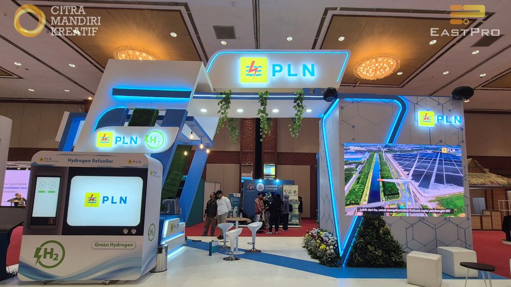
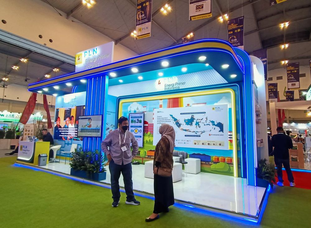
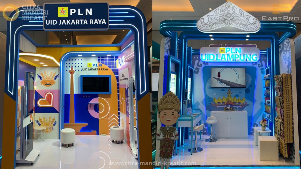
1. Clear and Organized Messaging
Your booth’s graphic design must deliver a clear message within seconds. Ensure a well-structured message hierarchy, starting with your company name or main slogan visible from afar, followed by detailed information accessible when visitors come closer. Prioritize what you want to highlight, such as your logo, product, services, or tagline. Some elements may stand out more prominently, while others remain standard in size.
For instance, the hierarchy could start with bold letters placed at the top of the booth for your company name or main slogan. As visitors approach, they see a large image showcasing your products or services. Once they step inside, they can explore detailed information about your offerings.
With a well-structured message, your booth will look more organized and won’t confuse visitors.
2. High-Quality Images
Images are the first thing visitors notice. Therefore, ensure all the images in your booth are high-quality. Avoid blurry or pixelated images, as they can damage your booth's professional impression. Use high-resolution and sharp images that are visually appealing and draw attention to your booth.
Planning your booth meticulously is crucial so all aspects, including images, are well-prepared. Don’t let rushed preparations compromise the image quality or overall design. Remember, your graphic quality reflects your brand’s quality too.
3. Readable Fonts
Don’t underestimate the power of font selection! Fonts must be clear and readable, even from a distance. Avoid overly complex or decorative fonts that make your message hard to understand. Use a combination of sans-serif fonts for headings and serif fonts for descriptive text if needed. Most importantly, ensure the font size is large enough to grab attention.
Font size, readability, and placement should all be carefully considered. Fonts can also convey certain moods. Some are creative and modern, while others are formal and traditional. While elegant fonts are essential, clarity and attractiveness are even more crucial. Make sure your font choices align with your branding.
4. Minimal but Informative Text
Less is more!
Avoid cluttering your booth with too much text. Focus on the main points you want to convey, such as your brand name, tagline, or a few bullet points about your product’s key benefits. Leave the detailed explanations to your team or staff interacting with visitors. Minimalist and concise text makes your booth look cleaner and more professional.
The main goal of your booth is to capture visitors' attention first. Once they’re intrigued, detailed explanations can be provided inside the booth. Don’t forget to proofread all text before printing graphic materials. Once printed, typos cannot be corrected.
5. Attractive and Harmonious Colors
Color selection plays a significant role in catching attention. Use colors that align with your brand identity while ensuring harmonious combinations. Choose contrasting colors for the background and text to make your message easily readable. Keep in mind that colors also have psychological effects, so select ones that match the impression you want to convey, such as blue for calmness or red for energy.
Here are some colors and their associated perceptions:
Blue: calm and peaceful
Green: soothing and refreshing
Red: energetic and powerful
Orange: warmth and cheerfulness
Yellow: optimism and positivity
Purple: luxury and creativity
Neutral colors (gray, beige, brown) convey warmth and tranquility and are often used to balance vibrant colors.
You can also opt for complementary colors or variations of the same color palette to create a cohesive and visually appealing design.
Graphic Element Placement in the Booth
Aside from the 5 graphic design elements mentioned above, the placement of graphic elements in your booth is equally important.
1. Primary graphic elements in the booth should be readable from less than 30 meters away. These could include the company logo, product brand, or an image of the main product.
2. For peninsula booths, primary graphics can be placed on the hanging sign at the top or on the tower section.
3. For in-line booths, graphics can be placed on the canopy top with the maximum allowed height.
Create an Outstanding Booth with EastPro!
If you want a booth that grabs attention, there’s a lot to prepare. Graphic design being a critical part of it. While there are many details to consider for your booth’s graphic design, don’t worry! Collaborating with EastPro for your booth design and construction will make things hassle-free.
EastPro will ensure your booth’s graphic design aligns with your branding and concept. With our experience as an exhibition booth contractor and event booth creator for various companies, we’re ready to help you craft a booth with creative and innovative graphic designs.
Your booth will surely stand out with graphic design elements that captivate visitors. Contact EastPro now and let’s make your booth the center of attention!